
CLIENT
Marie Louise de Monterey
CONTRIBUTION
Research
CX Design
UX/UI Design
YEAR
2023
Optimizing the Checkout Experience
I was asked to improve the user flow for an Australian e-commerce site, experiencing an increased drop-off rate during checkout, leading to abandoned purchases, and also to increase their average order value (AOV) by introducing checkout cross-sells and post-purchase upsells.
By refining the user journey and integrating strategic cross-selling opportunities, my goal was to create a smoother, more intuitive path to purchase while maximizing revenue potential.
Industry Research & Insights
UX trends and studies on payment friction in Australian e-commerce were researched, two sources consulted extensively were ;
1. Baymard Institute – Extensive research on cart abandonment and checkout UX.
2. Statista – Reports on Australian online shopping behavior.
62%
AUSTRALIAN CONSUMERS USE SMARTPHONES TO PURCHASE ONLINE*
50%
AUSTRALIAN CONSUMERS PURCHASE ONLINE WITH A CREDIT CARD*
30%
DROP OFF FOR EACH STEP OF THE CHECKOUT JOURNEY*
70%
SHOPPERS ABANDON THE PURCHASE ONLINE
User tests & sessions
The checkout flow was tested with existing customers (who received a discount voucher on their next purchase). The sessions were recorded, and we identified several new friction points through the transcripts and confirmed suspected friction points. I looked at the customer support scripts to find anything related to the difficulties or successes with the payment and checkout process in the current UI design.
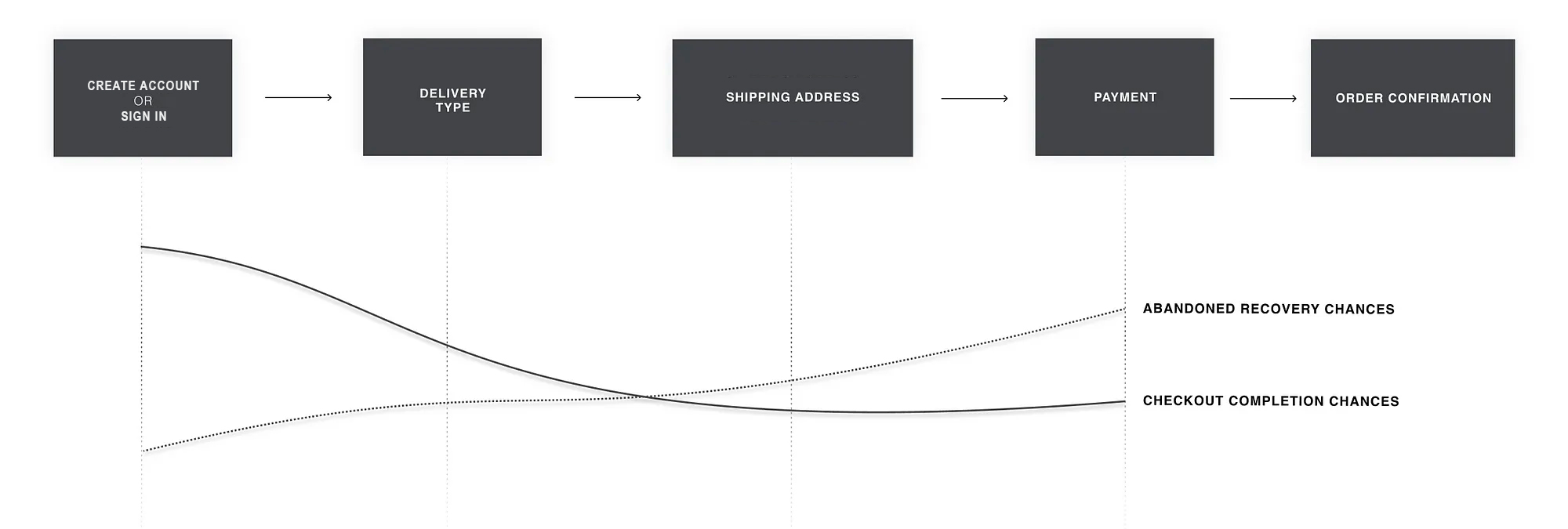
Audit & analysis
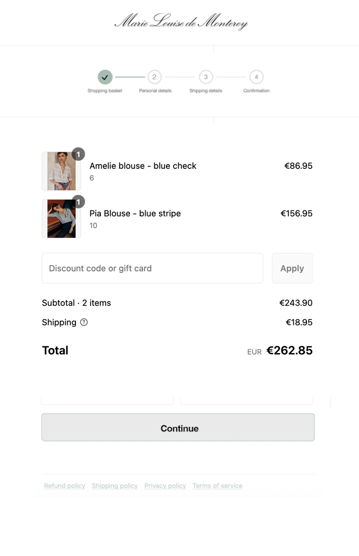
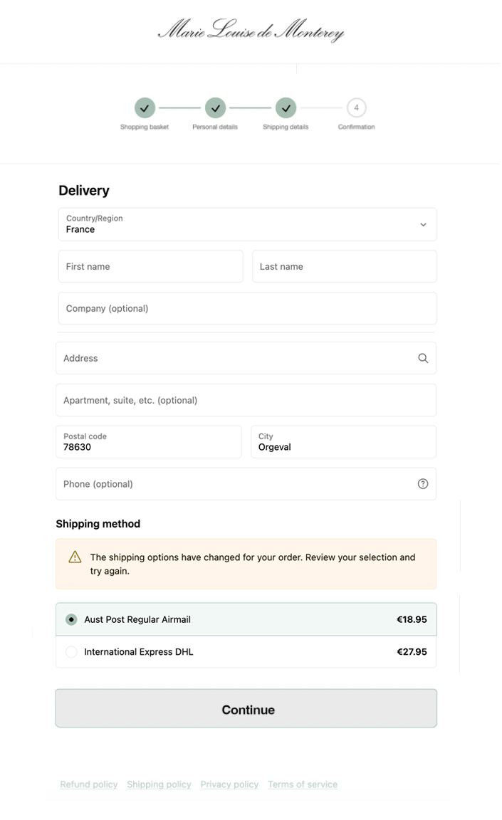
The existing checkout flow separated over several screens with a progress tracker to keep users engaged but still did not prevent abandonment due to the number of steps to complete the payment process. Speaking with the owners, it was understood that the application's payment flow had been designed to keep pages short, limit form fields, and avoid excessive scrolling.
Using analytics, we could see a 20-30% drop in sales completion from the start to the end of the payment process.
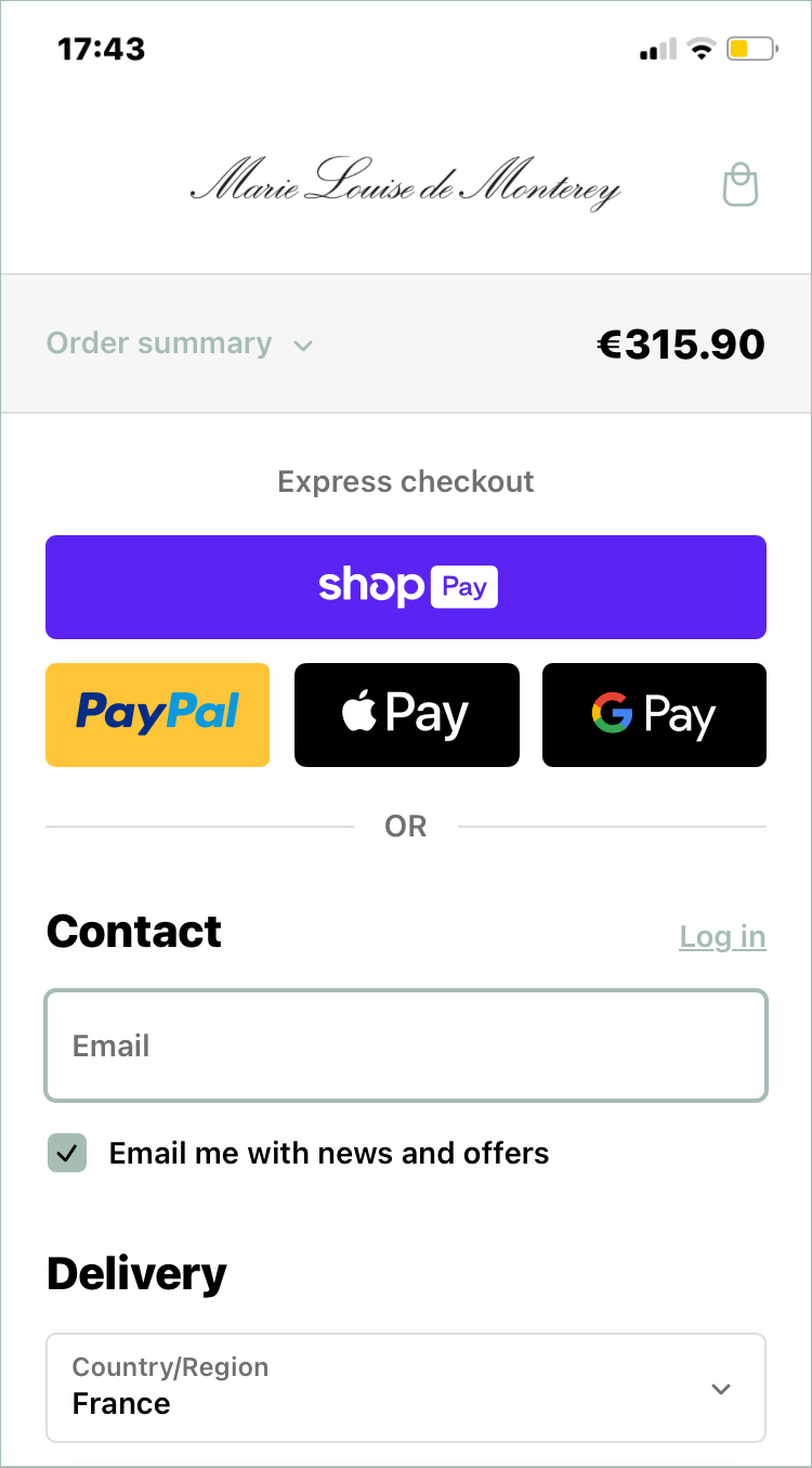
Our design approach was Mobile First
The user flow on smartphones was focused on, to make the checkout process mobile-friendly; checkout pages were automatically resized for a small screen, and shoppers saw large finger-friendly checkout buttons and fonts that encouraged them to complete a purchase through their smartphone.

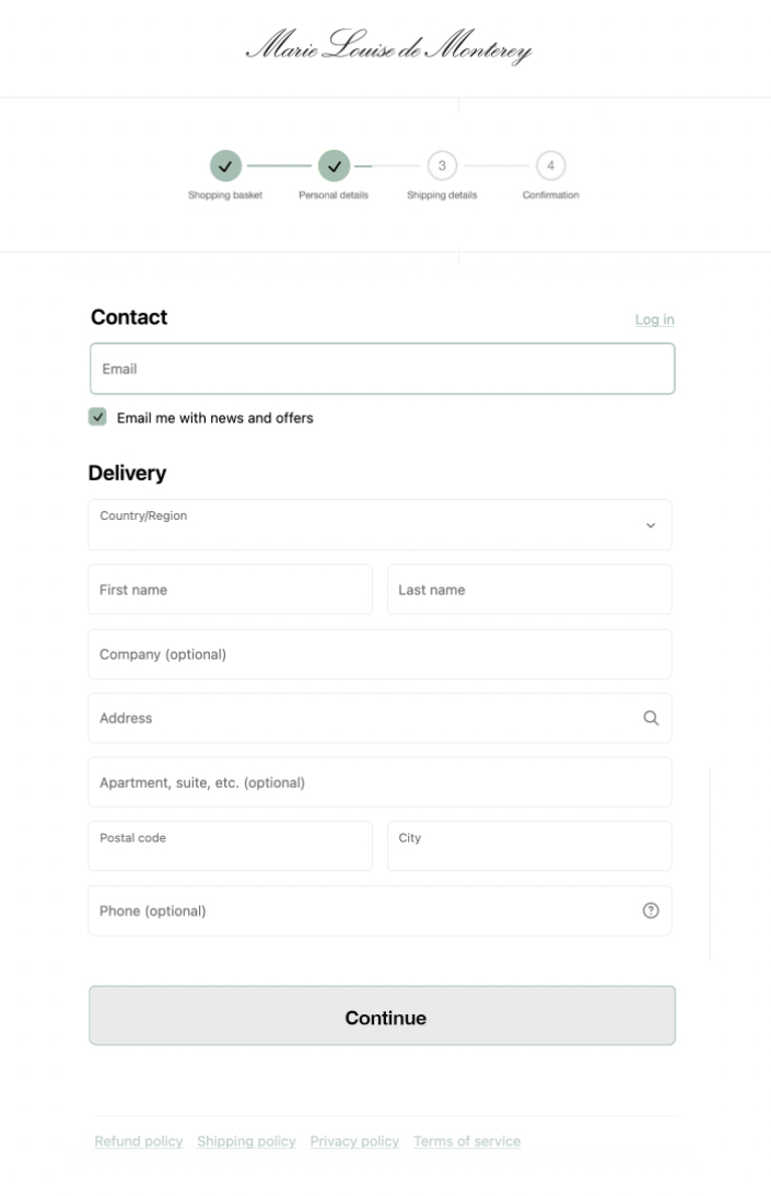
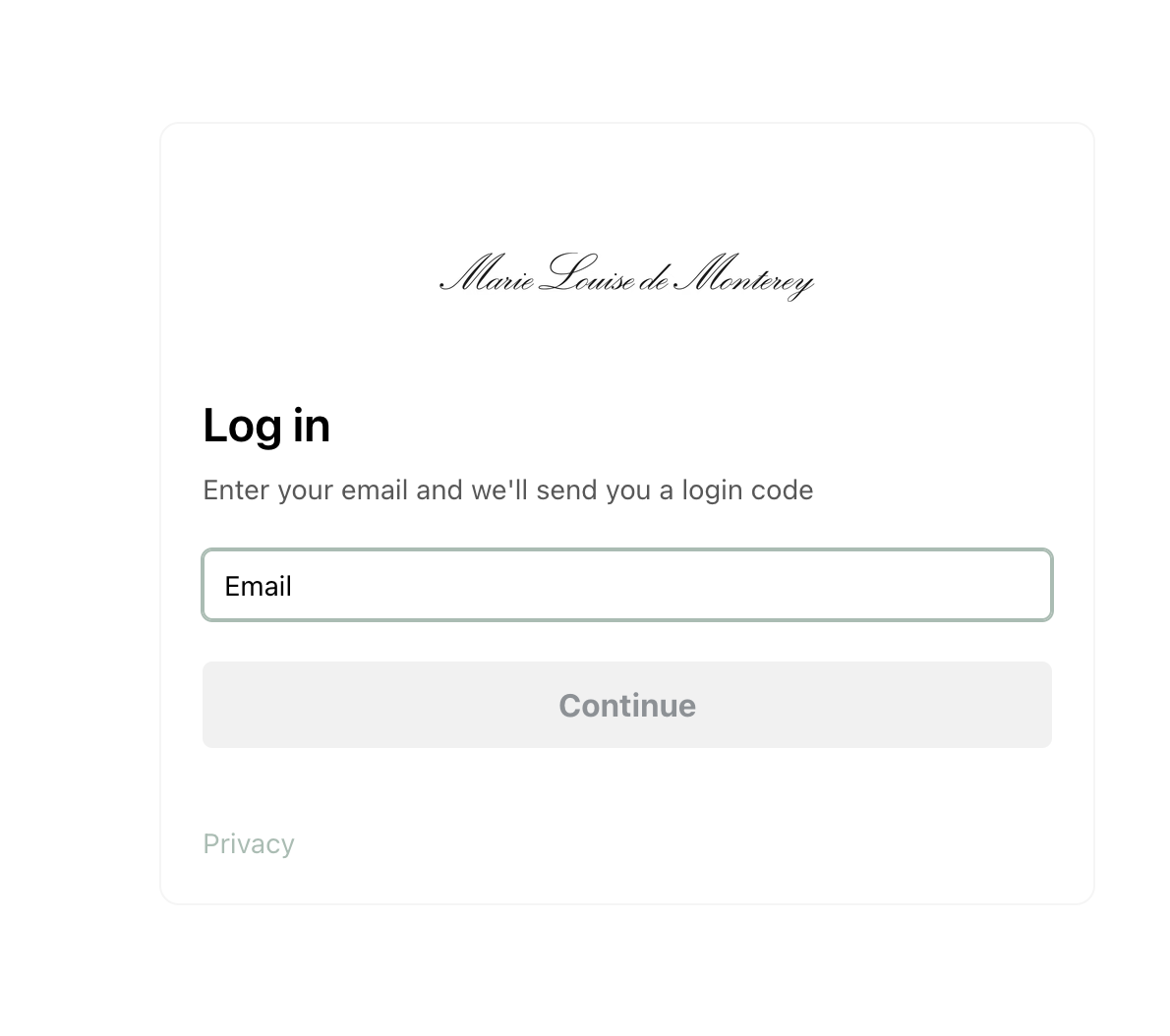
Password & Reset
During testing, it was observed that extensive and strict password rules were responsible for a 20% checkout abandonment rate among existing account users who have trouble signing in.
In particular, the password-reset email is a weak link in the “forgot password” chain, as any issue with the password-reset process locks a user out of their account, at which point abandonments are very likely.
This was resolved this by asking for the user's email to send an active link for sign-in.
Account Selection & Creation
25% of customer abandonment was identified at the account creation stage so a guest or express checkout was added to fluidify the payment process, it was placed as the most prominent option on the account selection step to ensure users can easily find it. For the usual account sign-in, we also added auto-filled form fields.
Added Payment Providers
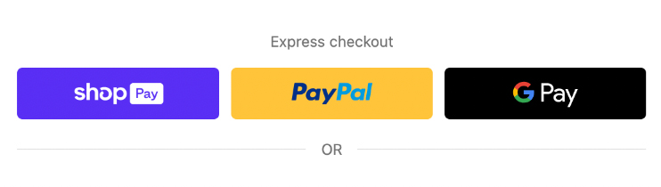
While the majority of online purchases were made using credit cards, in line with a mobile-first evolution in the UX/UI, and increasingly, payments would be made via digital wallets, Google Pay, Shop Pay, Scalapay, and AfterPay were integrated to optimize the AOV, with BNPL payments on the rise.

06
IMPROVED PAYMENT FLOW
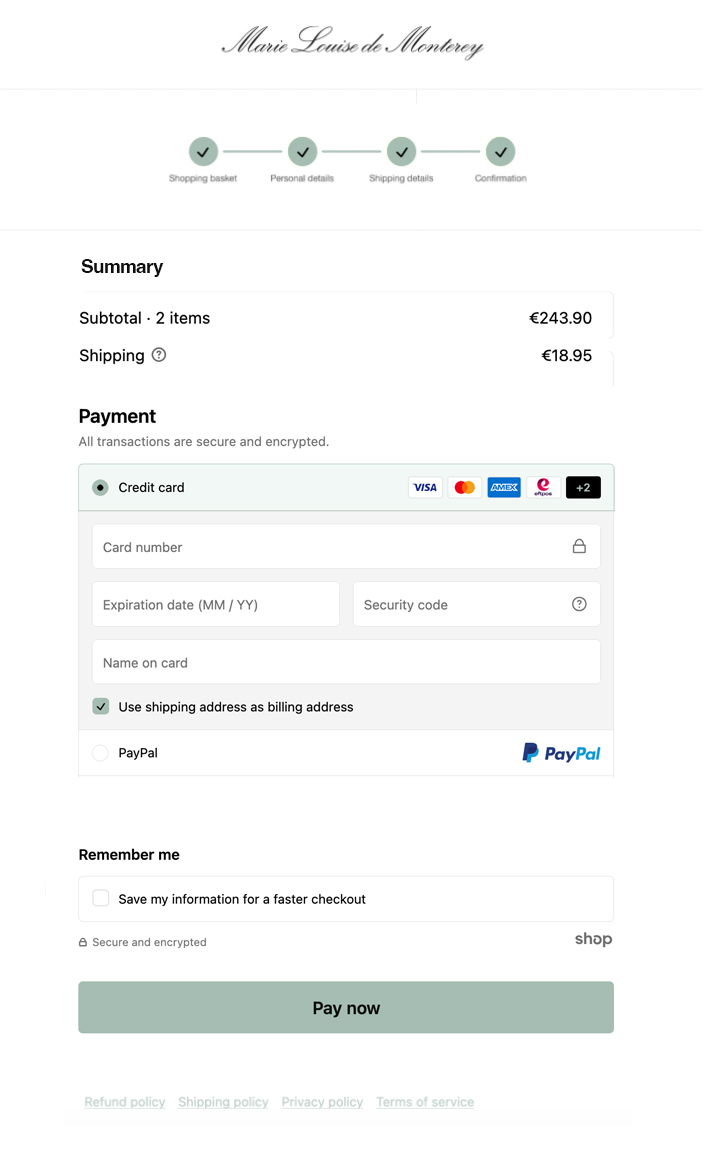
Re-designed for performance
The ergonomics changed for the checkout as the payment flow was combined into a single page for efficiency, with auto-filled fields. Already, this single step has started converting more customers, and we saw an increase in conversions and less cart abandonment by more than 20%.
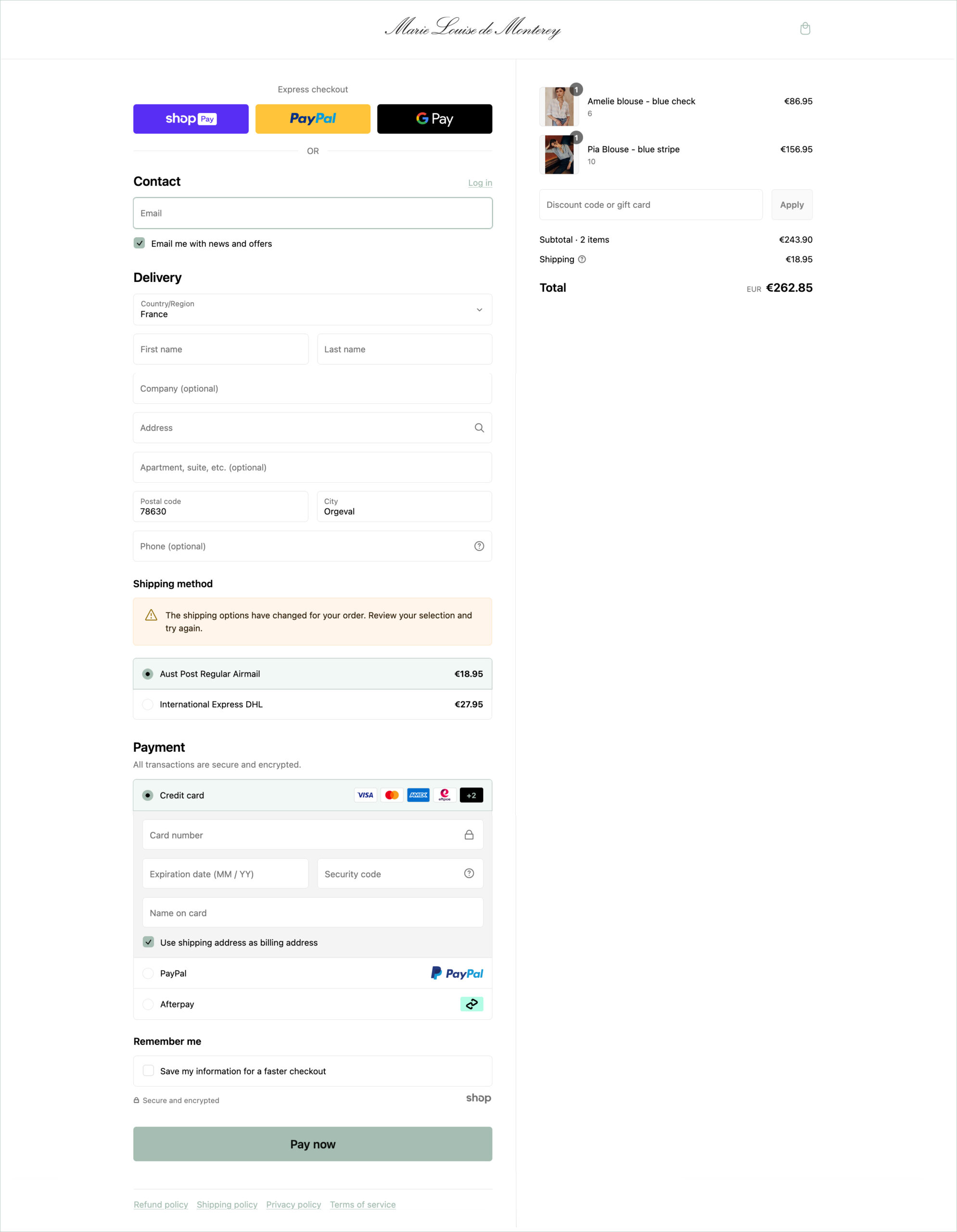
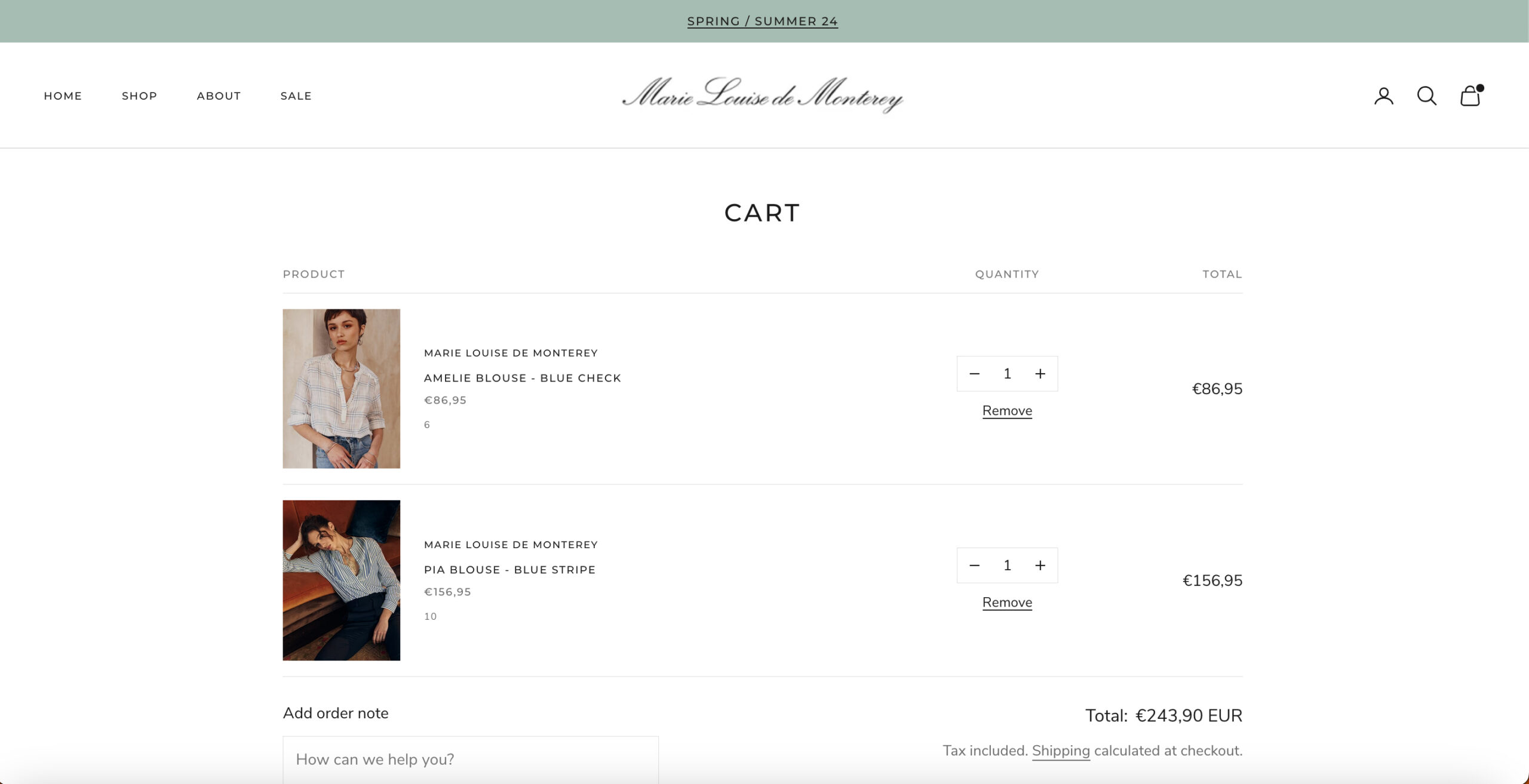
The redesigned checkout/payment page (Desktop)
Elevated Purchase Summary on Mobile
The purchase summary was elevated and became a 'Sticky' feature on the checkout page so that customers could easily confirm what they were paying for, which minimized errors and unnecessary returns on orders.
In the mobile experience, the purchase summary remained above the fold with a collapsible panel, so it could be easily consulted throughout the payment process, therefore reducing errors in orders and returns.
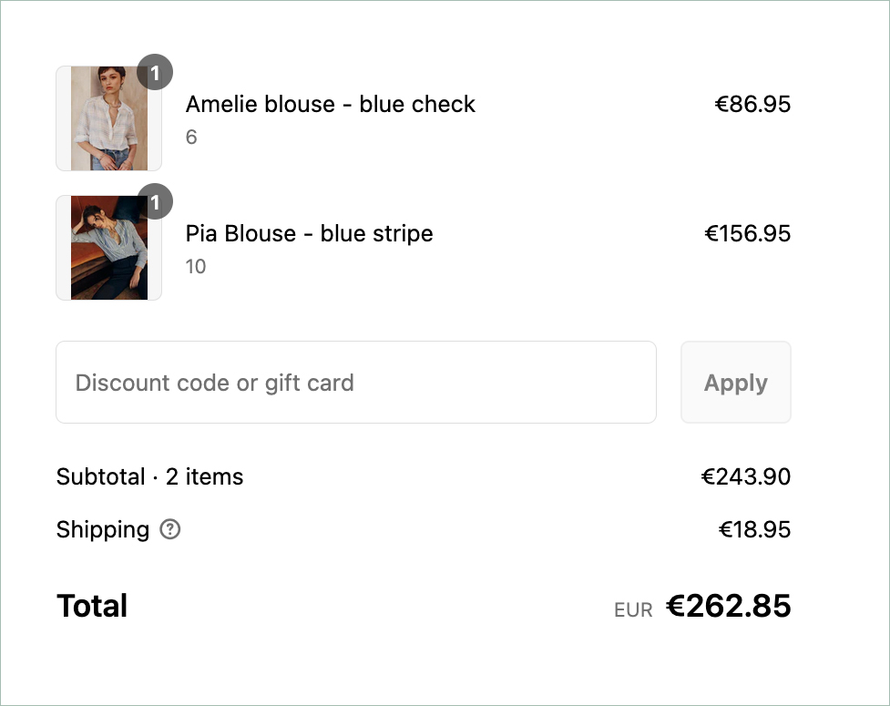
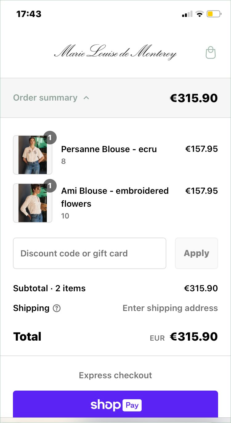
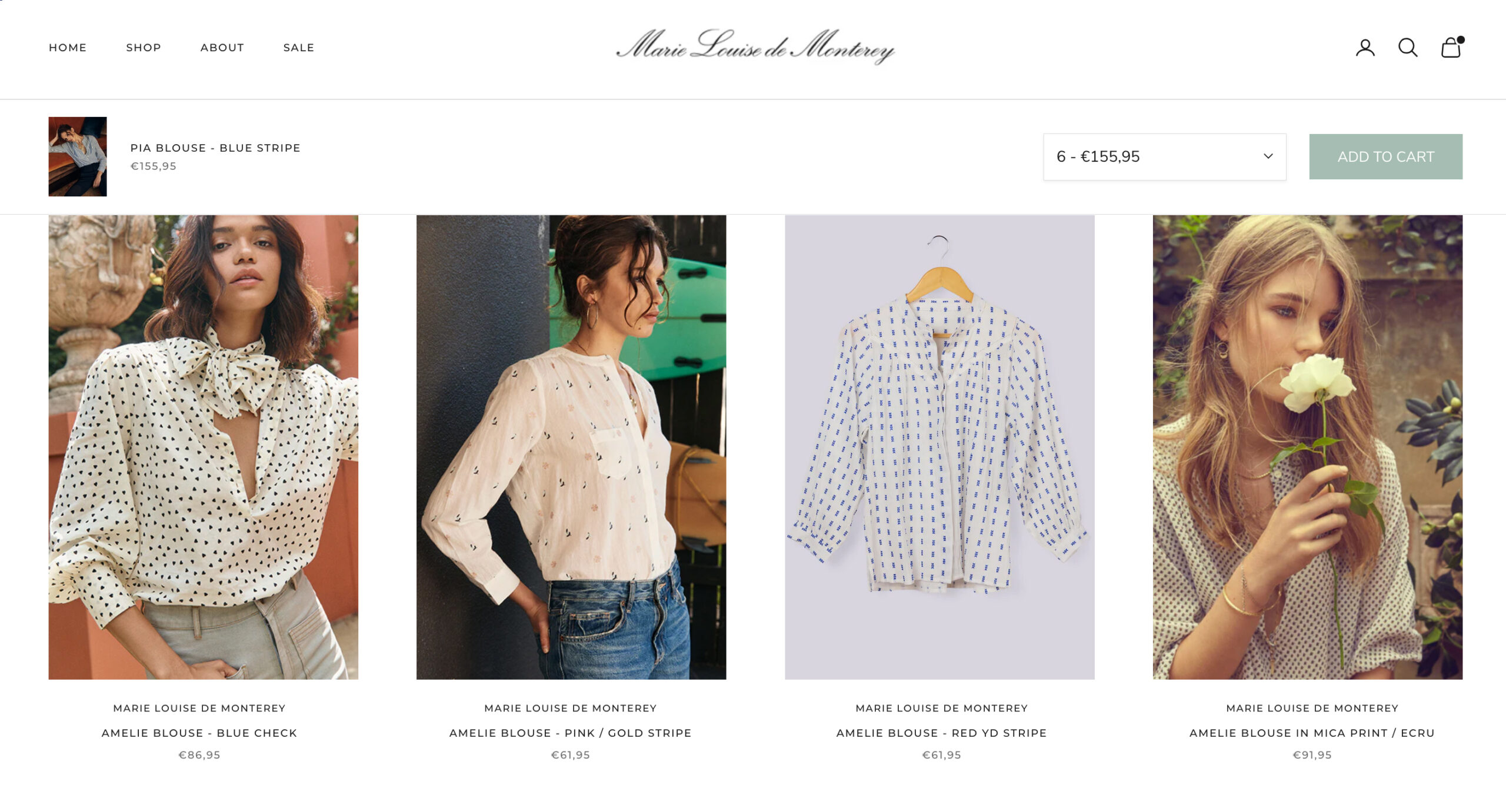
Cross-Selling Enhancements
We added relevant product recommendations before payment, which in turn increased AOV by more than 30%.
08
KEY OUTCOMES
30%
DECREASE IN CART ABANDON
40%
INCREASE IN CONVERSION RATE
60%
INCREASE ON AVERAGE ORDER VALUE
75%
REDUCTION IN SUPPORT REQUESTS
Key Takeaways
- Over half of the users abandoned pages that took over 3 seconds to load.
- Nearly 3/4 abandoned their carts due to unexpected costs, complex checkout flows, and security concerns such as a lack of trust signals (badges, known payment providers) to increase conversions.
- Speed and ease to complete the payment were important, yet required some friction with trust badges. Making the process too fast through A/B testing, we discovered that it did not reassure customers, and they were likely to cancel their orders subsequently.
* (Sources : Baymard Institute - 2023, PayPal Checkout Study, Google’s Mobile UX Report).
+ 33 (0) 6 62 81 69 54
penstar@email.com
Orgeval, 78630, France.
© | 2026