CLIENT
Servier Pharmaceuticals
CONTRIBUTION
Competitor Audits
Interviews
UX / UI Design
Brand
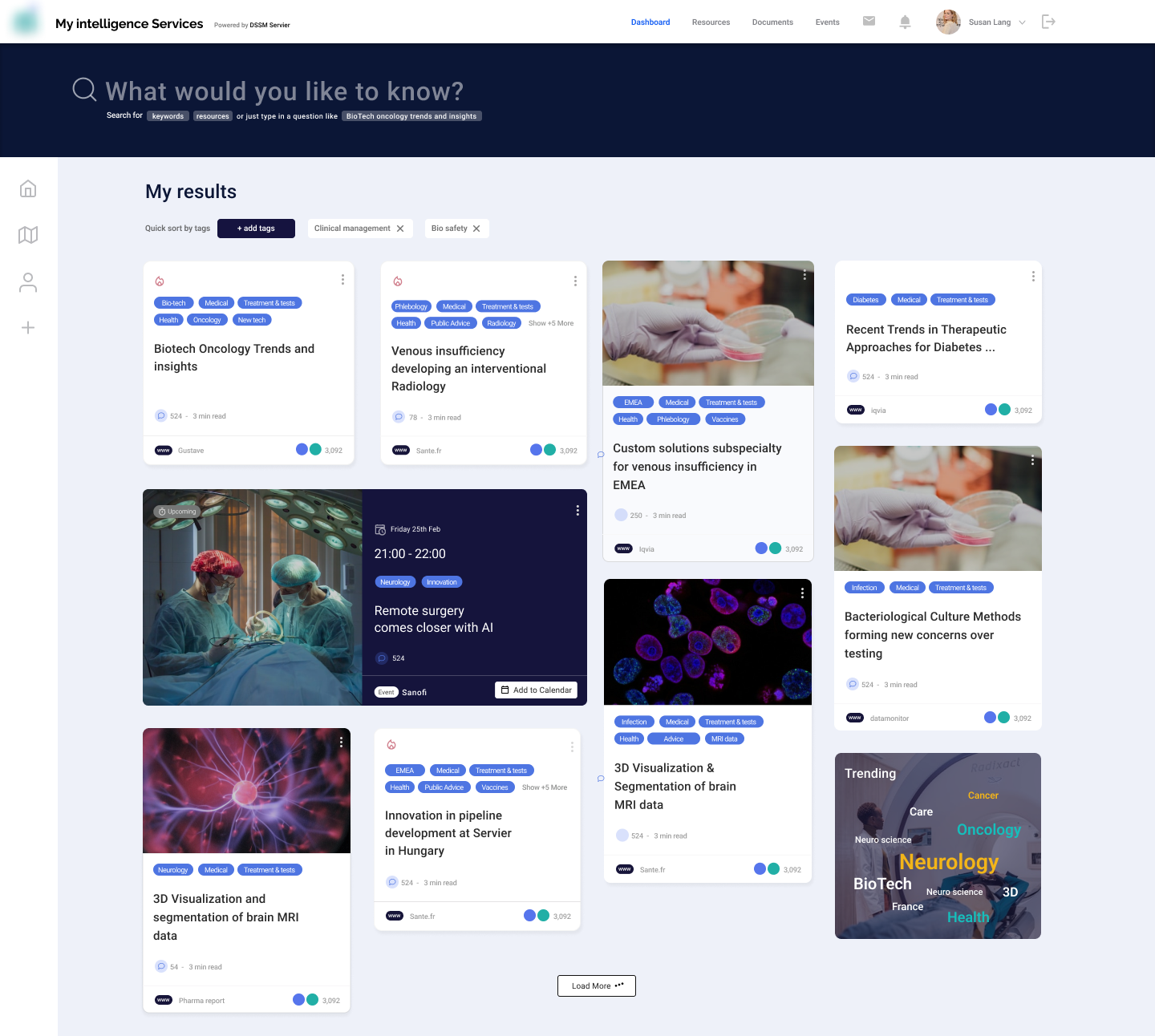
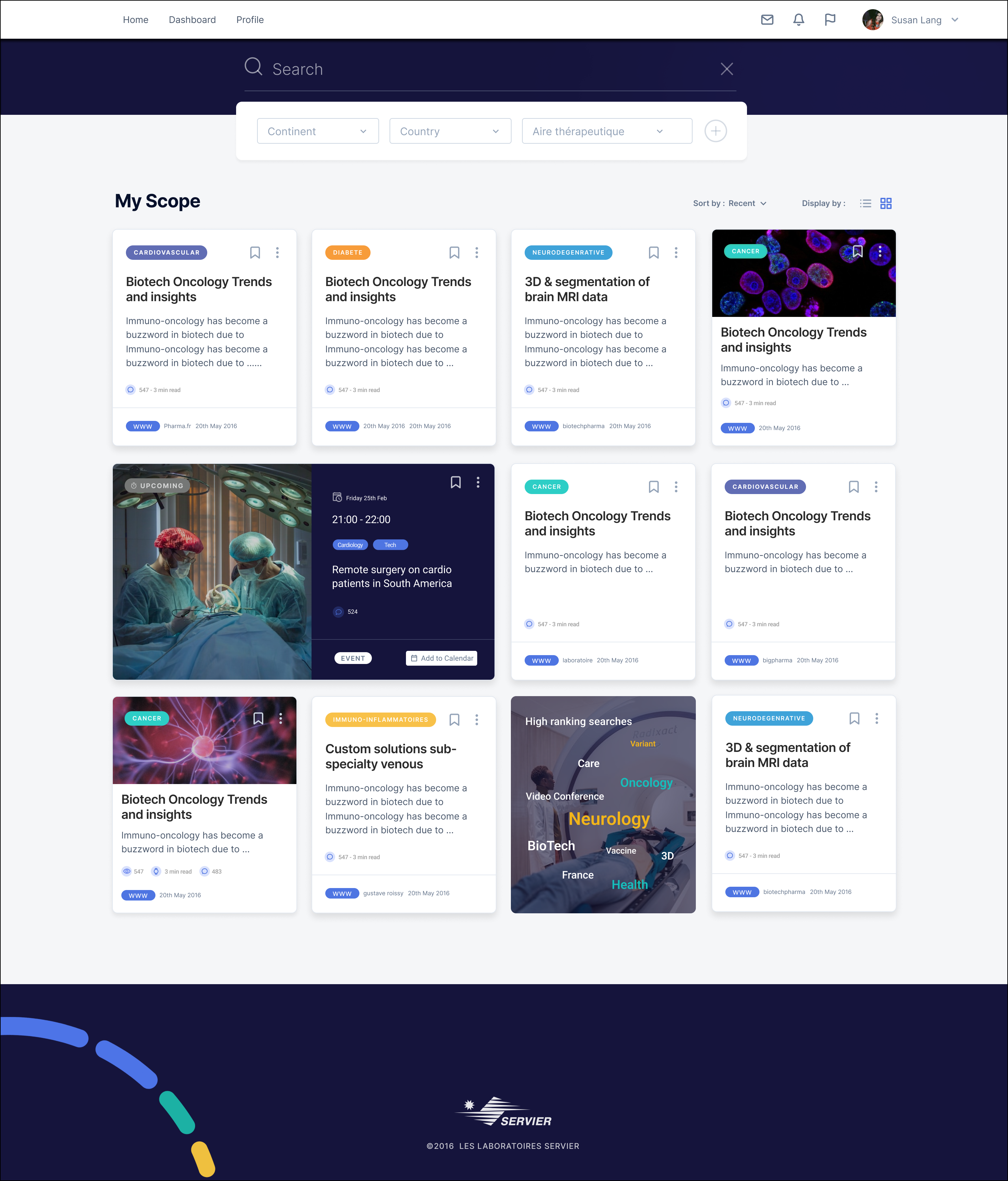
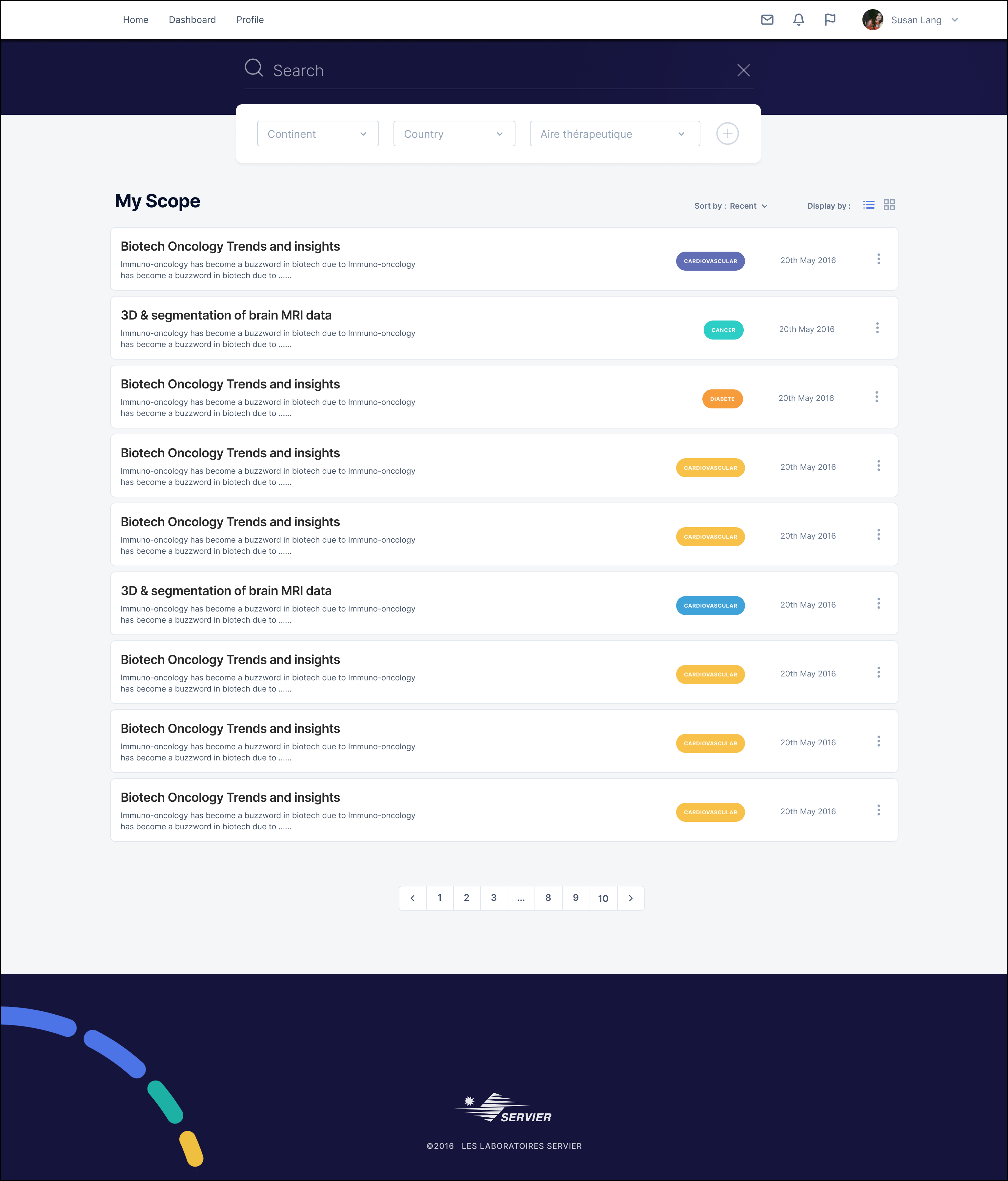
Designing an Optimized Search
The DSMM (Direction Stratégique Médicin Mondiale) at Servier Pharmaceuticals, present in over 150 countries worldwide, requested a secure Cloud-based platform to consolidate and share their strategic documents and medical reports worldwide.
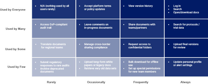
The challenge we determined would be finding the right strategic documents and reports in a vast digital repository, as users often struggle with unclear filters, irrelevant results, and inefficient navigation.
Our goal was to redesign the search experience by implementing intuitive filters and facets, improving relevance, speed, and usability.
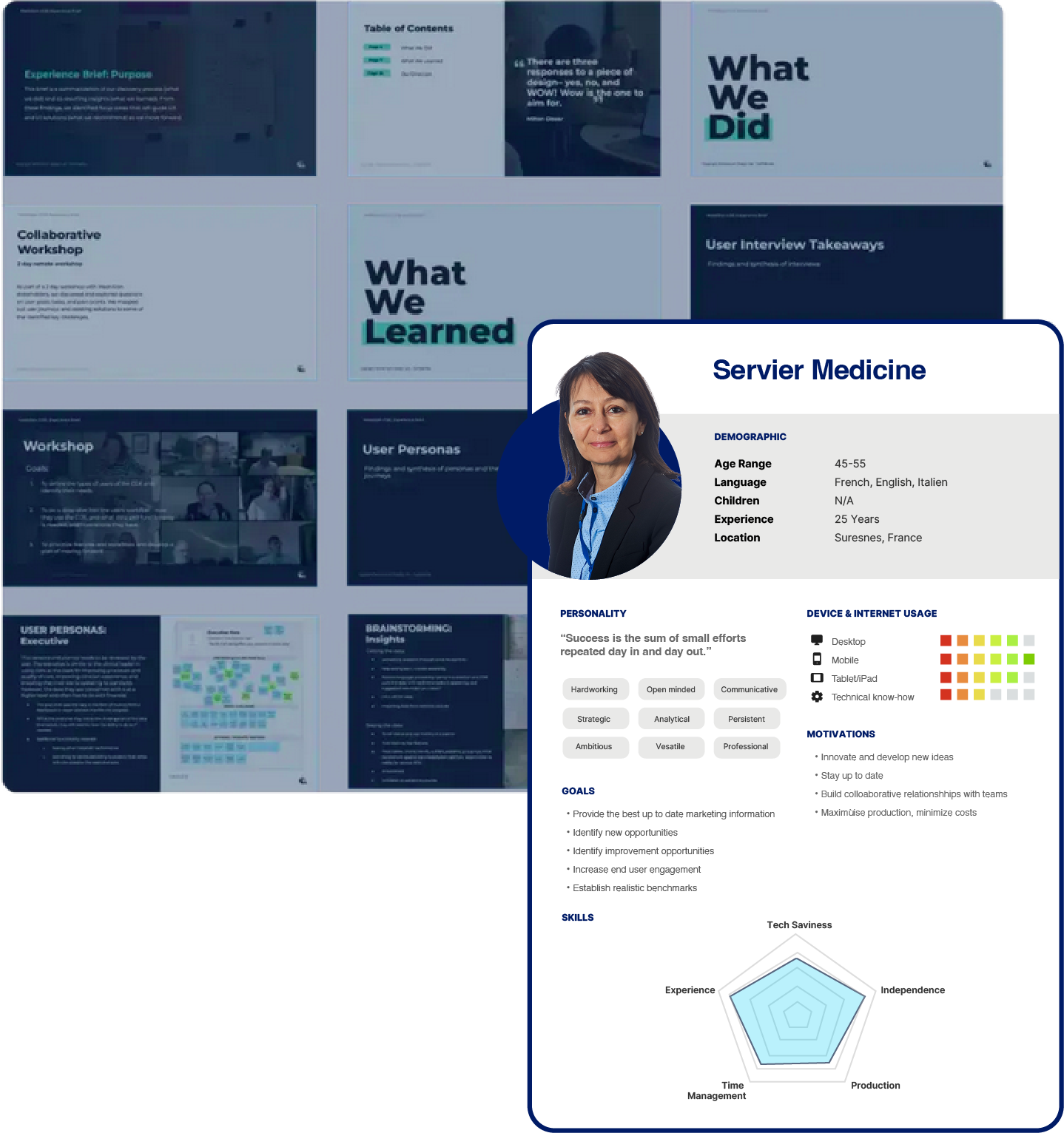
Identifying the key users
As this was an internally sponsored project, we kicked off with a briefing and several interviews with key stakeholders to listen and learn about their requirements. They would also be the end users, but as this was not just reserved for the C-suite, I hunted down other potential users to understand their expectations of such a platform. An interesting highlight was the ability to save searches and receive notifications on new document additions and links to external industry subscriptions.
Identifying a red route flow for a MVP
Working closely with technical and business stakeholders, I identified the core user flow (or "red route") that would define the MVP for the pharma document-sharing platform. Through collaborative workshops and sketching sessions, I mapped ideal user journeys—from document upload and categorization to sharing with specific roles—ensuring the experience remained intuitive and focused on key outcomes such as, access control and audit trail visibility.
Afterwards, the technical team validated the proposed flows to assess feasibility within existing systems and timelines. This collaboration helped refine flows to match infrastructure constraints, surfaced early technical blockers, and created a shared foundation for an MVP centered on real user needs.
Mapping the User Flow
I mapped out the critical task flow of document submission, validation, and access by different roles—reviewers, admins, and compliance officers. To create a high-level user flow view for the MVP, with identified features described to facilitate discussions.
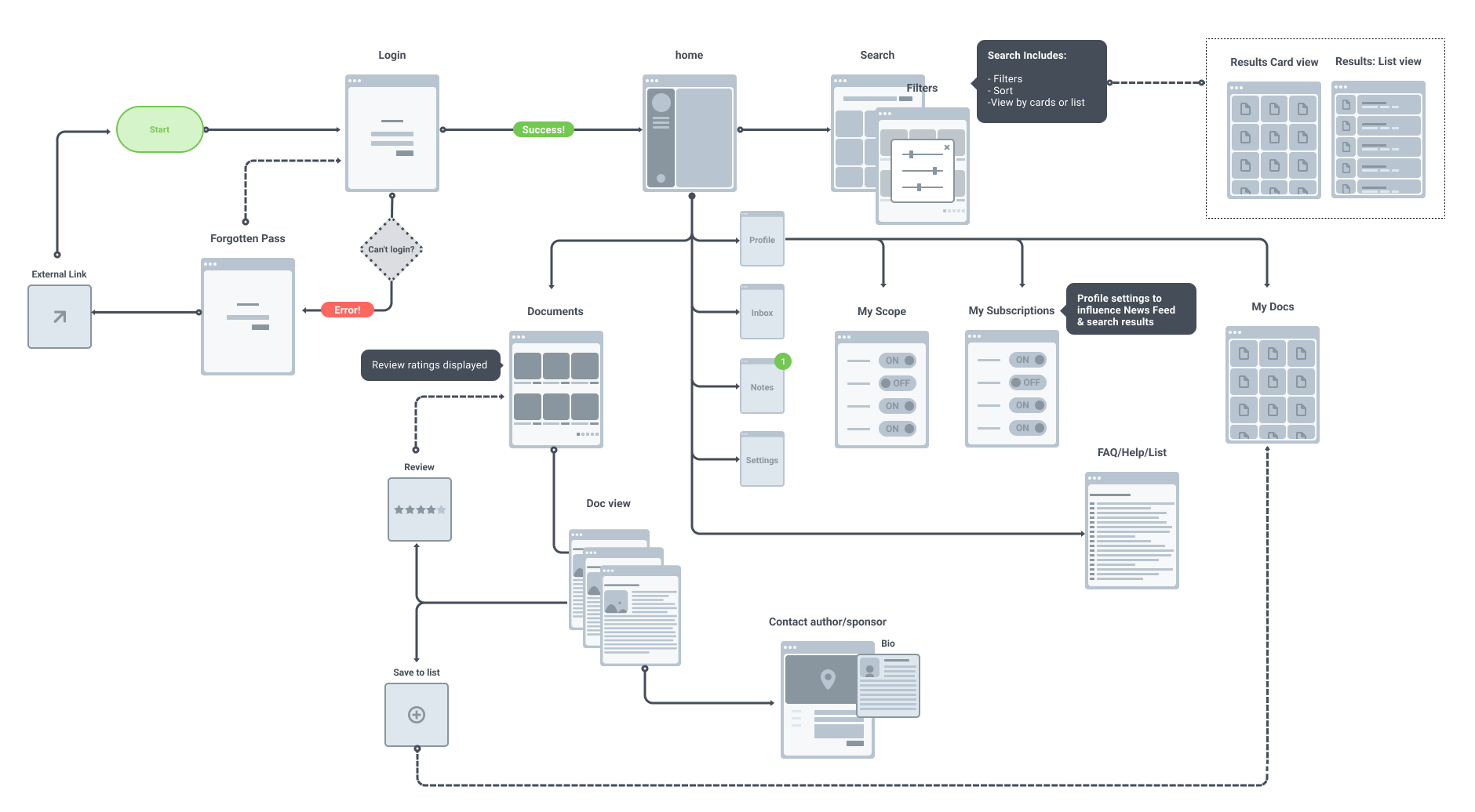
Key User flow - High level view on the functional requirements
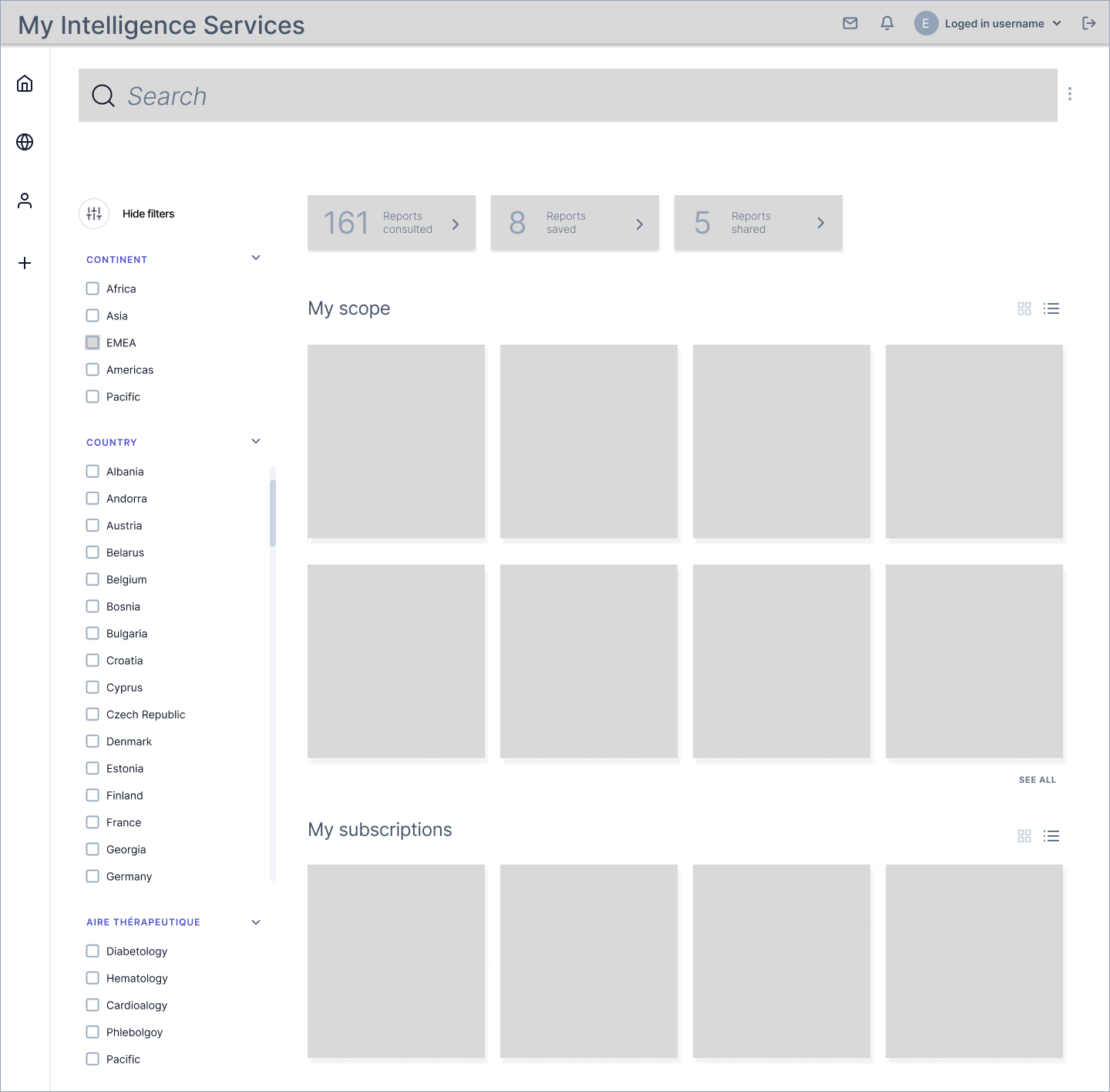
Information Architecture
The information architecture was intentionally kept streamlined with an emphasis on personalisation to improve user adoption for the MVP or version 1.0 of the platform. Features—such as customizable dashboard views, and user-specific content visibility—to foster a sense of relevance and ownership early in the experience. These features laid the groundwork for more complex interactions in future iterations.
Another primary goal was to reduce cognitive load and ensure a smooth onboarding experience for first-time users. Core navigation was designed around essential tasks, allowing users to quickly understand where to go and what actions to take, without overwhelming them with secondary options.
Looking ahead to version 2.0 and beyond, the architecture evolved to accommodate advanced functionalities, including an integrated instant messaging system, contextual notifications, and smarter content recommendations. These additions were planned on the initial structure without compromising clarity, aiming to enhance engagement while supporting more dynamic, collaborative user flows.
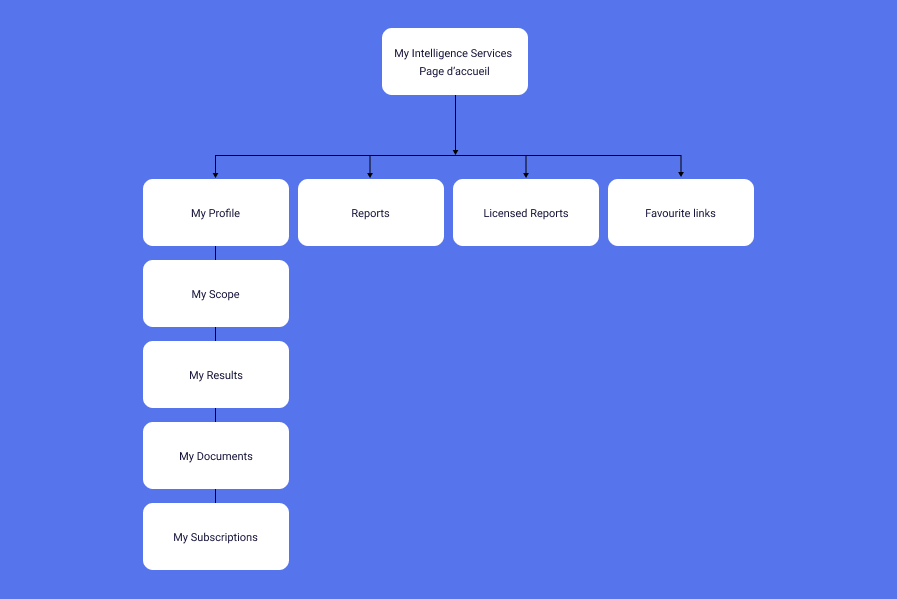
The Information Architecture version 1.0
The Service Blueprint
A service blueprint was created in collaboration with the engineering team to clarify the various user access levels and their corresponding tasks or functions within the platform. In this case, the blueprint focused on the process of submitting a new document, outlining each step from the user's initial interaction to the system's backend responses. This included touchpoints such as authentication, form validation, file upload, and confirmation feedback, as well as the roles of different user types—such as admins, reviewers, and standard users—throughout the process. Mapping out these interactions helped identify potential friction points, ensure consistency across user flows, and align the technical implementation with the intended user experience.
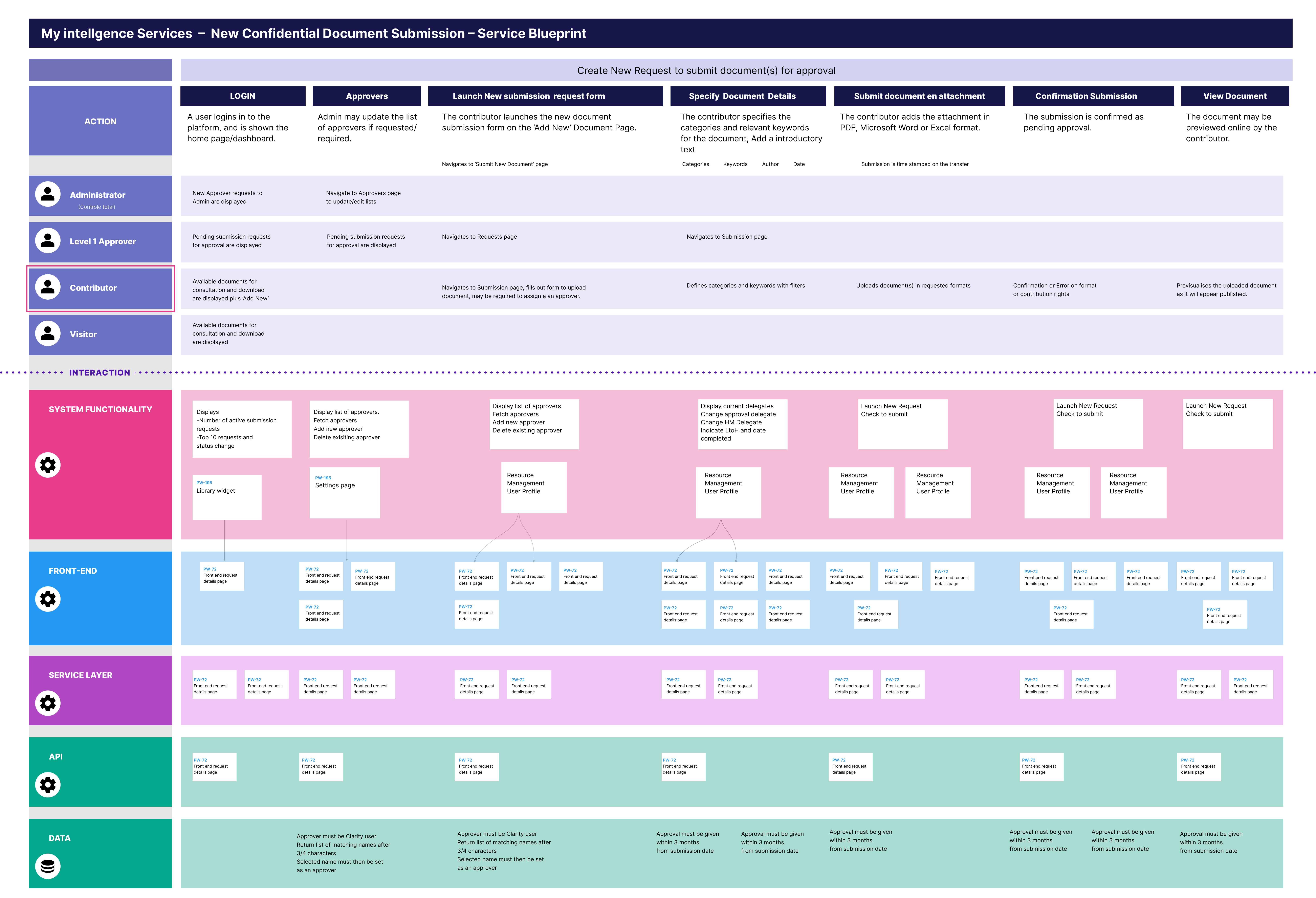
The Service Blueprint - New Document Submission
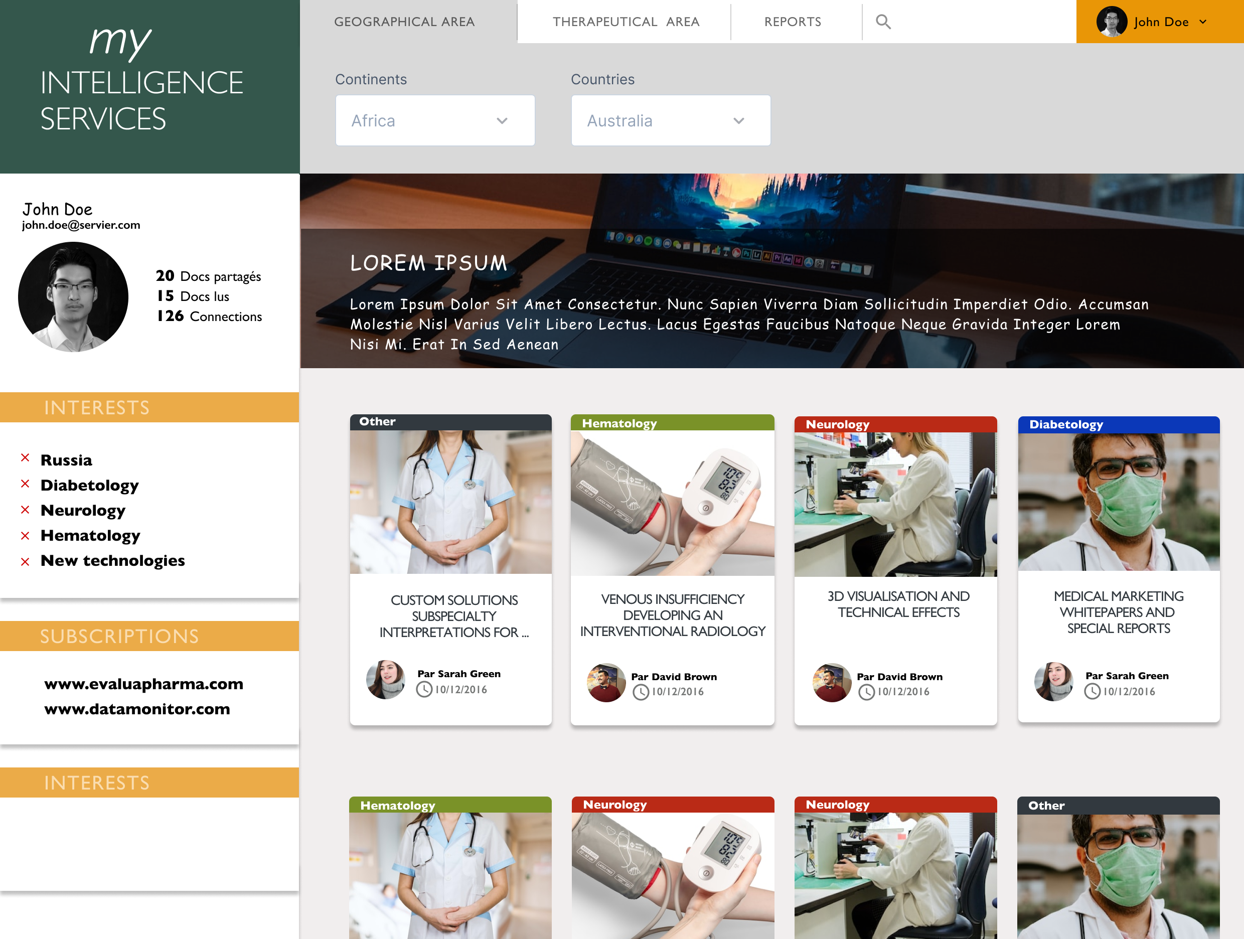
The Existing Design Proposal
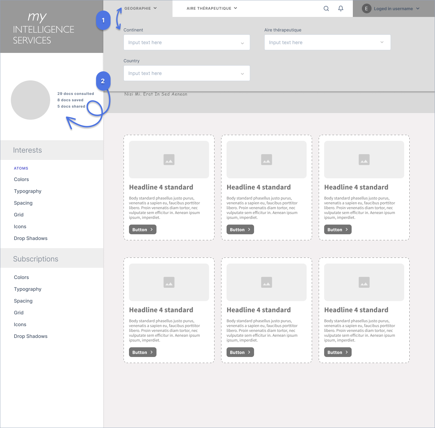
I was provided with an existing design as a point of departure, which I turned into a wireframe to focus discussions with stakeholders on functional features for a MVP (Minimal Viable Product). Helpful to understand the intended user flow, visual hierarchy, and brand considerations, while also identifying areas that required refinement or clarification.
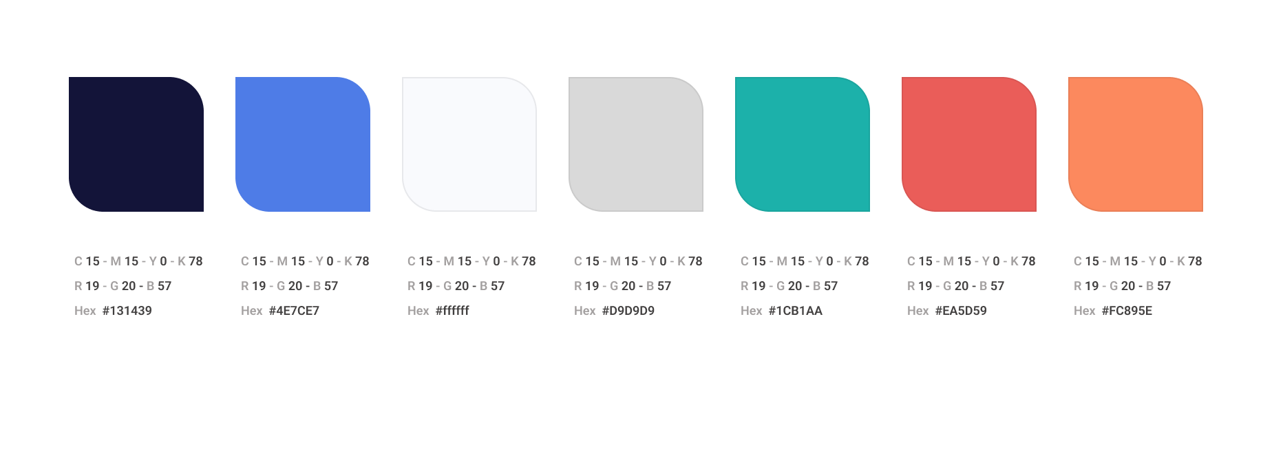
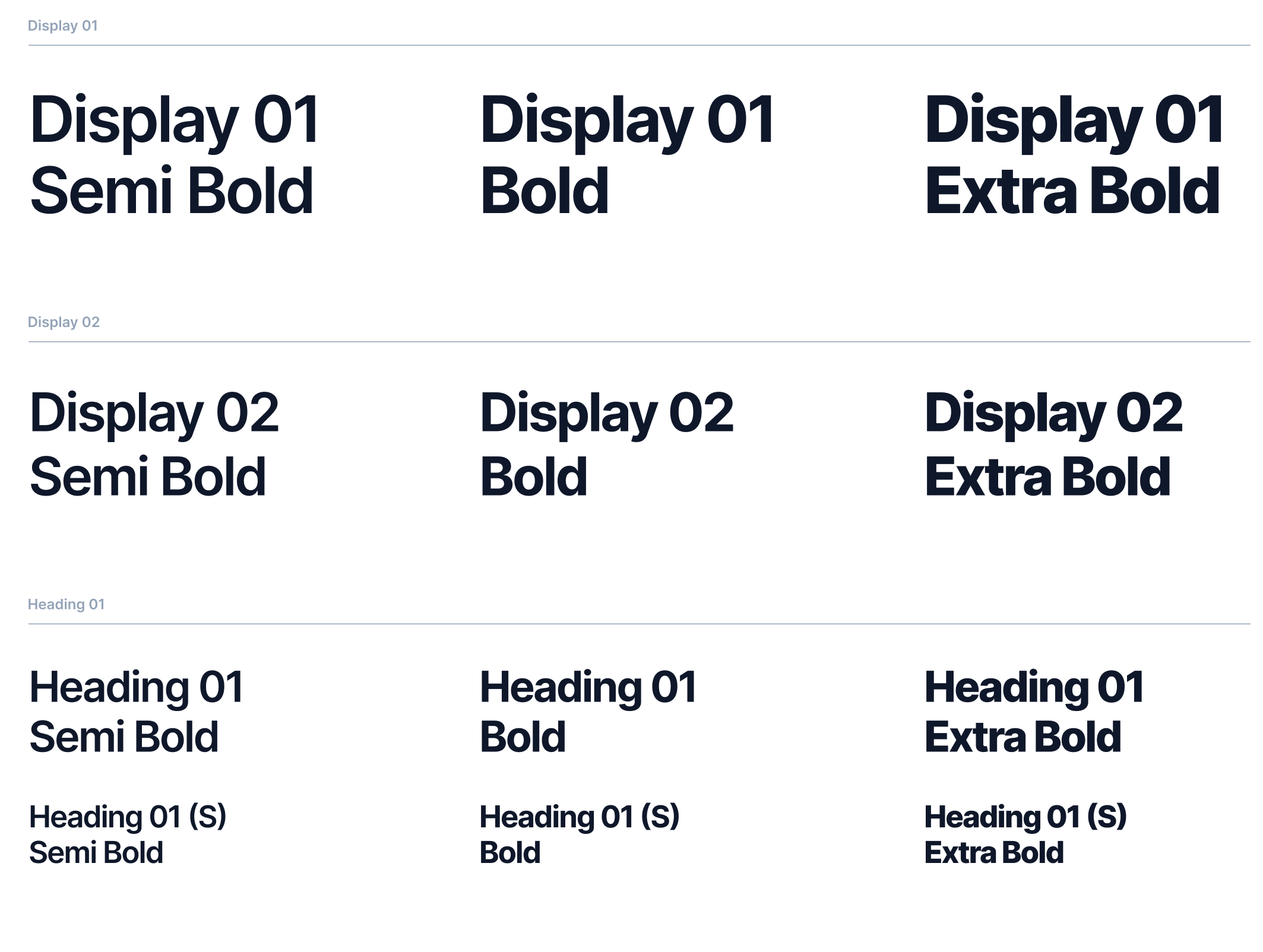
Brand & Design System
+ 33 (0) 6 62 81 69 54
penstar@email.com
Orgeval, 78630, France.
© | 2026